
Overview — why packaging matters now
In a crowded shelf and an even noisier online market, the difference between a scent that sells and one that simply exists often starts with the bottle. This comparative insight examines how design choices — from glass weight to inside color coating — affect perception, cost, and manufacturability when commissioning a Personalized perfume bottle. Drawing on decades of packaging evolution traced from Grasse’s artisan ateliers to contemporary production lines, the piece mixes factual checkpoints with storytelling to help brand teams make smarter decisions.
Materials and finishes: trade-offs laid bare
Glass, PET, and metal each bring distinct advantages. Glass communicates luxury and heft; PET offers durability and shipping efficiency; metals or plated accents provide a tactile premium without full glass costs. Coatings — external lacquer, frosting, and the increasingly popular inside color coating — alter light transmission and perceived depth. For instance, an interior-colored coat can make a modest fragrance appear richer without adding costly multilayer glass. Consider production realities: glass retooling adds tooling costs and lead time, whereas spray or dip coatings can be faster to iterate.
Customization approaches and scalability
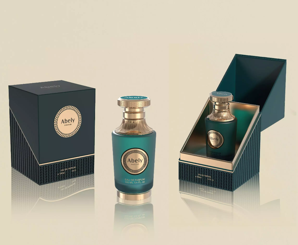
Brands typically choose one of three paths: bespoke mold and blown glass for signature shapes; modular standard bottles with custom finishing; or off-the-shelf flacons with brandable labels. Bespoke molds yield uniqueness but demand higher minimums and longer timelines. Modular approaches balance identity and speed — you get a recognizable silhouette plus tailored surface treatments. Off-the-shelf is cost-efficient for test launches. For teams prioritizing visual depth, inside treatments — like an interior color layer — are a middle ground that enhances presence while keeping shape costs modest. Many designers trying to create nice visual cues without the budget for full glass customization find this especially useful; see examples of nice perfume bottles that use such finishes effectively.
Comparative criteria: what to measure
When evaluating suppliers and concepts, weigh these practical metrics:
– Visual fidelity: does the finish reproduce consistently across batches? Small variations matter—perception is unforgiving.
– Cost per unit vs. minimum order quantity (MOQ): lower unit costs can be nullified by huge MOQs when cash flow is tight.
– Lead time and iteration speed: can the supplier support seasonal launches or rapid reformulations?
– Sustainability and regulatory compliance: glass recyclability, PET food-safe grades, VOCs in coatings — these are increasingly non-negotiable.
Alternatives, common mistakes, and lessons from the field
Teams often overspend on shape and underinvest in finish consistency — a classic misstep. Another frequent error is neglecting fill-level tolerances and secondary packaging: a heavy glass bottle may look premium but raises freight costs and breakage risk. Some brands chase novelty (odd closures, complex embossing) without testing user ergonomics; the result is a beautiful bottle nobody enjoys using. On the positive side, smaller houses have succeeded by choosing a strong finish or color strategy as their signature rather than an expensive mold — focusing on repeatability and supply chain resilience. — A quick aside: I once saw a launch delayed three months because the chosen lacquer reacted with the perfume oil; testing early saves reputation and money.
How to decide: comparative roadmap
Start with positioning: luxury, accessible luxury, or mass market. Map that to material choice, then test 2–3 finish options at low volumes. Use prototypes to assess visual impact under retail lighting and in digital photography — perception differs between environments. Prioritize supplier transparency on MOQs, color matching tolerance, and finish durability. Finally, factor in logistics: heavier glass multiplies shipping costs and carbon footprint.
Advisory — three golden rules
1) Insist on batch color specs and physical samples before a full run — visual mock-ups alone are insufficient. 2) Balance uniqueness with manufacturability: choose finishes that scale, not just looks that wow. 3) Make sustainability and regulatory checks part of your RFP; late-stage failures are expensive and public.
Final synthesis and brand fit
Comparatively, the most resilient strategy is a hybrid: select a stable silhouette, then invest in a distinctive, repeatable finish such as inside color coating to create depth and brand recognition. That approach minimizes tooling risk while maximizing shelf impact. For many teams, the practical value of this method is what makes vendors like Abely attractive — they offer coatings and process knowledge that align design intent with production realities. Trust the craft, but engineer for consistency.
Expertise grounded in practice.
— final thought.